contact us

Use the form on the right to contact us.

You can edit the text in this area, and change where the contact form on the right submits to, by entering edit mode using the modes on the bottom right.


123 Street Avenue, City Town, 99999

(123) 555-6789

email@address.com


You can set your address, phone number, email and site description in the settings tab.
Link to read me page with more information.

L + J Blog

quilt, create, inspire

Botany Backdrop

Lauren

As I've probably mentioned in previous entries, my roommate in Atlanta was a girl named Megan Kibby, who has since become quite the little photographer.

Her ideas/compositions are unique and off-the-wall and that's what makes them so completely fabulous. The photos in this blog entry (in my opinion) show off one of her more brilliant concepts!

Daniel and Alicia (two of Megan's clients) were wanting a natural/ eclectic/ Anthropologie style wedding, and she thought the fabric would make the perfect backdrop for the photo booth she planned on setting up outside of their reception.

Botany is made up of 5 colorways that all work well together... but these 5 colorways can also break up rather nicely into more specific color schemes.

In order to provide her with options that fit within their chosen colors, I put together the groupings shown below. (They chose the last one.)

Up until now, I've really only seen Botany used in quilts, clothing, and bags... It never even occurred to me that it could be used in its raw form... straight off the bolt.

The result works really well though... The colors play off each other beautifully and act as a nice compliment to the bridal party's coloring!

Basically, the way this idea works is, when guests are walking into the reception, they stop at the photo booth to have their picture taken. They get to hold signs... and make silly faces... and act completely spontaneous. All so that the photos come out with that same classic "photo booth style".

While waiting in line for the booth, each guest signs his or her name into the photo book and writes a message to the bride and groom. Each photo is then placed above that person's corresponding message (see photo above). This idea combines the guest book with the photo booth album... which is really quite smart! Kudos to Megan!

On a side note, you can view Megan's work on her website Out of the Box Photography and Design. I designed and programmed this site for her, which I'm super psyched about! This is actually the first site that I've put together using correct programming techniques!

There are a few additional features that I plan to add to her gallery sections and homepage, but if anyone wants to view her work, that's where to find it!

On another side note, I've just returned from my own sister's wedding this past weekend, which was an absolute blast!

(I'll have photos of the festivities in a later entry.)

I Love Creative People.

Lauren

And I love it even more when those people take awesome photos of their creativity and send them my way...

I received an email from a crafty genius out in Indiana named Britt who recently blogged about a quilt she was making with Botany! Her blog, Scrapyard, features an eclectic collection of projects that are sure to inspire... Between funky slippers, mini bloomers, crayon rolls, and quilts, she's definitely a jack of all trades in the sewing world.

Her Picnic Quilt is made of an assortment of 42 squares, ranging in size from 1/4" increments to 3" and 4" increments. It was inspired by a quilt by Ashley, which referenced Liberated Quiltmaking II by Gwen Marston.

The photos that she posted about her Botany project show the quilt while it while it was still in the production phase, something you don't see as often a you do final quilt photos... in my opinion, a rather nice change of pace. Part of what makes quilts so special is the process that came before the finished product.

My fav is the big safety pin below. If the Discovery Channel were to do an episode on safety pins...

Additionally, the photos themselves are beautiful! The lighting... the vantage points... the depth of field... everything. So I when I wrote her back about the awesome blog entry, I asked if she would send along some photos of the finished quilt. Which she did! (See below.) I absolutely LOVE them!

If anyone else has made a great project using Botany that they would like to share... take some pretty photos and send them my way! I would love to post them!

The Invitation Saga

Lauren

Well, it's official. Carrie Jung will be getting married to Jon Clausen on June 5th, 2010... and there are now 85 wedding invitations out there that back up the whole story.

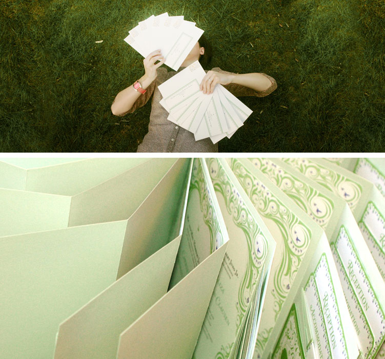
As my wedding present to Carrie, I designed her invitations and took care of all the printing. Carrie headed up the production department and cut, scored, folded, glued, and corner punched each of these 85 invitiation suites (see Carrie below).

Needless to say they took a LONG time to make... fights have broken out... tears have been shed... doors slammed... tv remotes and tape dispensers have been hurled across the living room... It's been a long, ugly journey... but I feel as though the end result has made it all worth it.

Formally worded invitations from back in the day were usually typed in a sappy/scripty font onto a blandly colored piece of paper (like off white or cream...) and then topped off with a sheer vellum flap of paper.

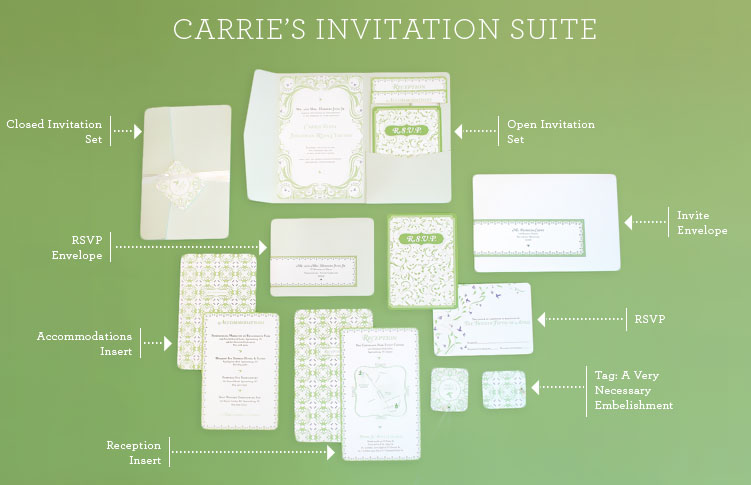
But there's no need to be boring when announcing such a happy day! I wanted this entire invitation experience to act as an emotional preview of what's to come... The envelope contains a branded tag that identifies which item in the suite you are receiving, as well as the recipient's address. It adds an eclectic sort of feel to the set. The first thing you will see when you open the envelope is the Invitation Folder that is folded up and held shut with a ribbon and tag. When you open it, you'll see the invitation on the left, and a pocket on the right that holds a series of cards. They are staggered in height so that you can see the title of each card, right at first glance. The Reception Card contains a map and a set of directions. The Accommodations Card contains a list of hotels in the area. And finally, the RSVP Card/Envelope sits in the very front of this little set. The arrangement of these individual pieces can be seen better in the photo below.

I believe the little details that are added towards the end of a big project make all the difference in the world, and one of these tiny details can be viewed in the photo above. There's a small row of purple flowers that make these invitations especially awesome... in my opinion.

Often times these details lie beneath the radar of the average observer, which is perfectly understandable... but when they do get noticed... everything suddenly becomes worth it. So I want to take this moment to say thank you to my sister's college roommate, Becca Crane. Becca has made the enormous chunk of effort that went into these invitations worth it because when she called to discuss them... she said, and I quote... "I especially loved that cute row of purple flowers."

The photo above is the rehearsal dinner invitations which uses elements from the initial illustrations, but in a slightly different style.

And that's about all I've got... After all was said and done, I really enjoyed this whole process, so if anyone is interested in personalized wedding invitations... I'm your girl!

Rainbow of Business Cards

Lauren

One of the first things that I love to do after finishing a big project is taking blog photos! I take A LOT and I waste a ridiculous amount of time... but it's so much fun to scroll through all of them later!

Right before Market we got about 500 cards printed up at Kinkos so that we would be stocked up and ready to go. 500 cards cost $100 dollars... making me feel pretty confident that the quality would be halfway decent.

This didn't turn out to be the case.

When I picked them up, I was horrified to find that they were the thickness of notebook paper!

So when my mom visited last month we worked on these little gems!

The idea behind our logo took quite some time for us to land on. I've always been taught to take the core essence of a company... then boil that down into its simplest, most iconic representation. But it’s sort of difficult to define our team without sounding completely sappy, and whether you're advertising a design company or encouraging people to use your brand of laptop to Visit foxybingo.com, it's probably best not to look a little dramatic. When I first began my logo exploration, I worked on a mother/daughter theme... but those were turning out to be lame. Then, I began fooling around with just a simple logotype, but when I took that logotype and tried to match it up with our various fabric line logos, total chaos!

Then one night it occurred to me that we don't really need to create a logo with a broad, all-encompassing kernel of truth... because our defining characteristic is what we're making... pretty patterns. So in the words of Marshall McLuhan... I decided to let "the medium (be) the massage."

The idea of using a hummingbird was arrived at rather arbitrarily... I like them and my mom likes animals that are tiny. While the symbol itself doesn't have any meaning... the way that we handle this symbol... does.

With every line that we create, the hummingbird will be updated accordingly. It will always be used to showcase whichever line is current. Thus making the designs the hero. Additionally, the way that that the hummingbird is cut out of its white background is reminiscent of reverse applique... a technique that is very relevant to fabric design.

This reverse applique technique was first used on our website's navigation bar... where the bird is cut out, revealing the yellow fabric from our Botany line.

This business card follows the same idea and is made up of two sheets of thick paper. On the front, the shape of our hummingbird is cut out from the card itself, then glued onto the other piece of paper, revealing the pattern through its dicut. The opposite side shows the full version of this pattern as well as a white tag containing our contact info. This technique gave our cards the tactile sensation of something that has in fact, been reverse appliqued... as well as thickening them up to the weight that I have always dreamed of!

The ten cards in these photos show patterns out of our next line, Hideaway! (Minus the black... because it didn't make the final cut.)

They make me happy every time I pull out my wallet...

It's about the little things!

A Book Review Blog Post

Lauren

lauren_jung_jessi_jung_bloghop_01

...by the family quilter Jessi Jung

Lauren and I were recently asked to participate in a blog tour to review a new book by Clotilde, called Jump-Start Your Quilting. The official tour dates are March 10th through the 16th. Seven designers (I'm sure you'll recognize many of them) are participating, and each reviewing one of the patterns from the book.

lauren_jung_jessi_jung_bloghop_03

First of all, I have to say this is a great book! The whole idea is to save time (or "jump start" your quilt making process) by using pre-cut fabric packs. These packs come in coordinating fabric lines, and they are already cut to fit the quilt pattern...putting you way ahead of the game.

Our assignment was to review a quilt called Shadow Play, by Julie Weaver. The skill level is beginner. In my opinion, this quilt was so fun and easy to put together. There are no seams to match, except when joining rows, and it is the type of quilt that can be quickly constructed using an assembly line process. I used fabrics from my stash (to get a feel for the pattern), which can easily be done, but pre-cuts make it a breeze.


lauren_jung_jessi_jung_bloghop_04

To see more pattern reviews, be sure to visit the other blogs on the tour:

March 10 : Victoria at Bumble Beans Inc. March 11 : Linda at Quilt Cookies March 12 : Here's our website too. March 13 : Pat Sloan at her blog March 14 : Melanie at Texas Freckles March 15 : Aunt Pitty Pat at her blog March 16 : Glenna at Holly Hock Quilts


While this blog hop only reviewed 7 patterns, Clotilde compiled over 45 adorable projects for this book, including quilts, pillows, and gift ideas. Every project in this book includes clear directions, color-coded diagrams, various skill levels, and pre cut pack requirements.

I highly recommend that you all check out
Jump Start Your Quilting
by Clotilde.

lauren_jung_jessi_jung_bloghop_02